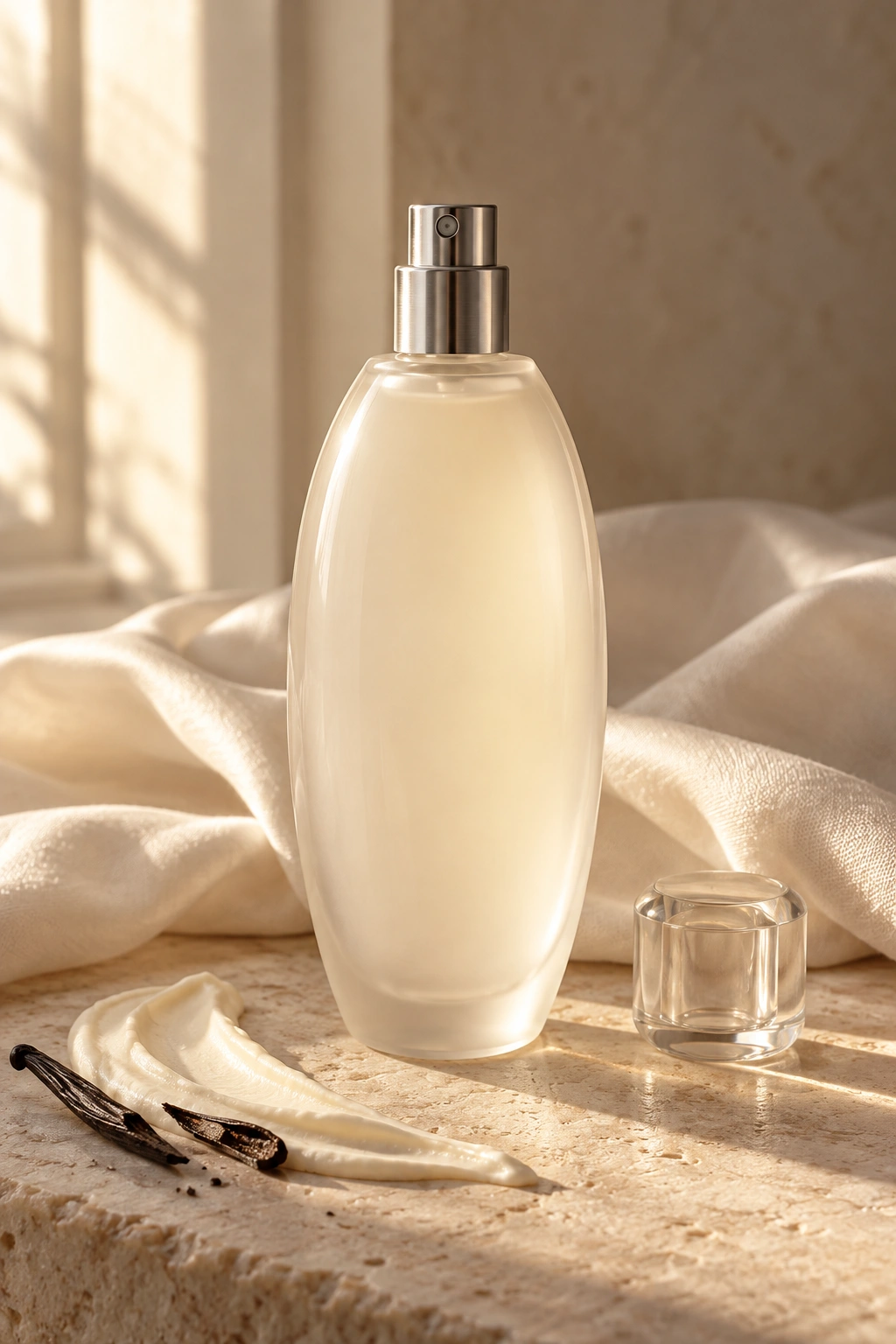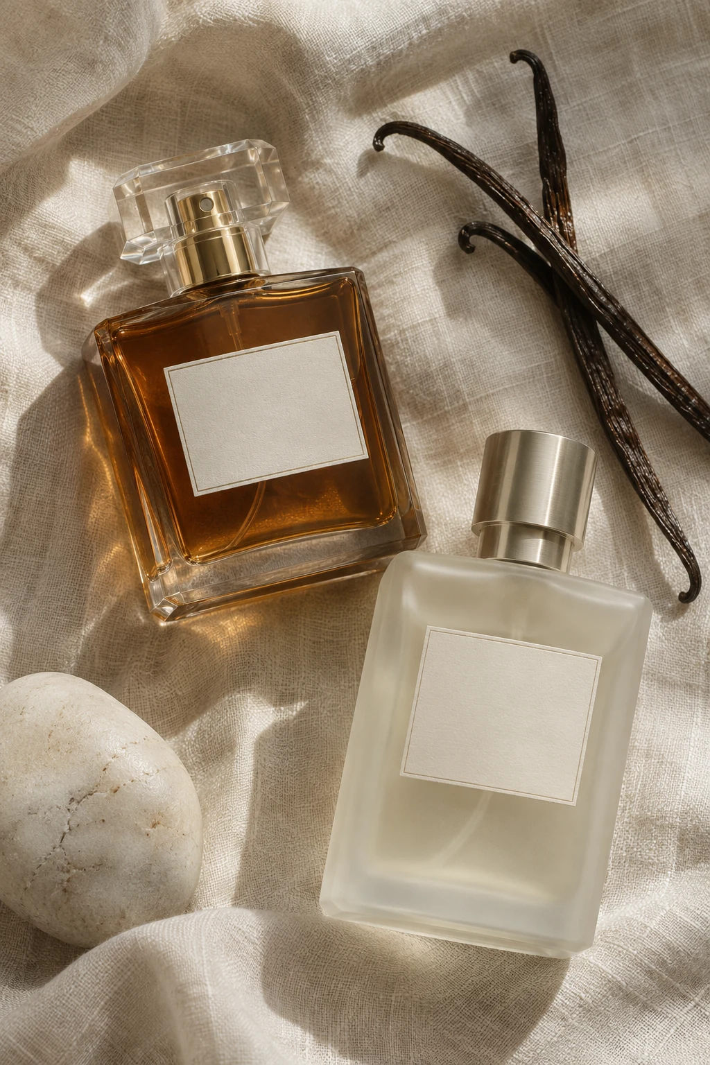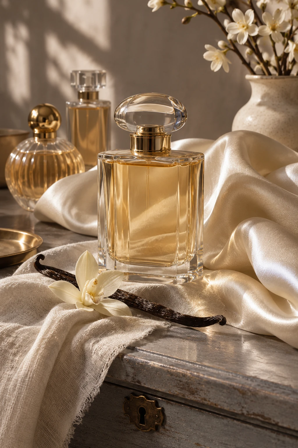
Vanilla has a reputation for sweetness, but the material can be imagined through a much wider set of textures. A linen fold suggests a quieter treatment. Dark wood or slate makes the same idea feel drier, while pale silk gives it softness without adding anything edible to the scene. This edit starts with those contrasts and follows them across ten arrangements. Each photograph places an unbranded bottle among materials chosen to suggest a different side of vanilla. Think of the images as a way to describe the mood you want when you explore fragrance, from something crisp and spare to a deeper composition in shades of plum and bronze.
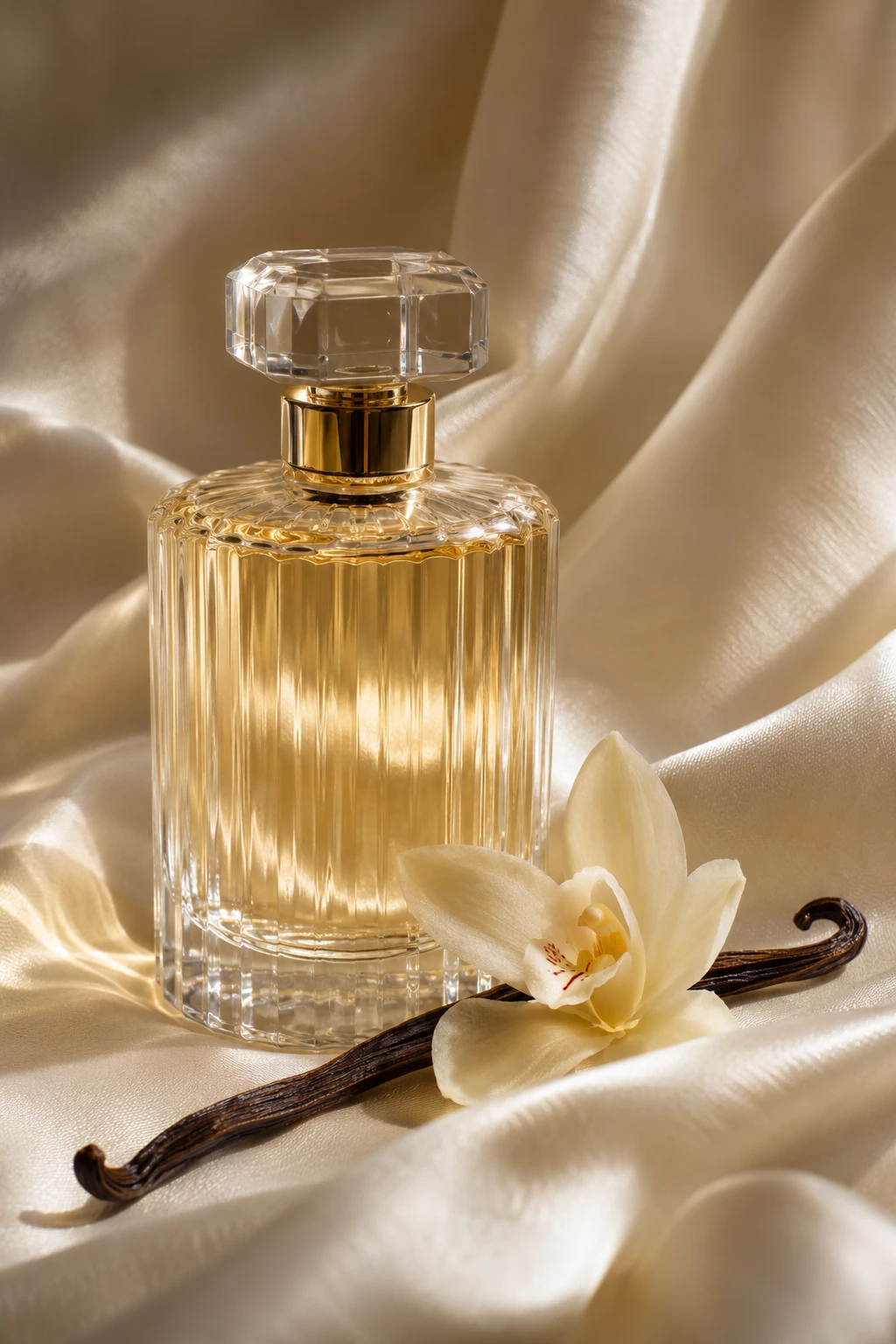
Creamy silk
Let the silk gather loosely so the curve of the fabric softens the straight edge of the bottle. One vanilla pod gives the image a precise reference. Bring the camera close enough to see where the two surfaces meet. The small changes in brightness around that junction are what give this setting its depth. That small contrast gives the composition a clear place for the eye to rest.
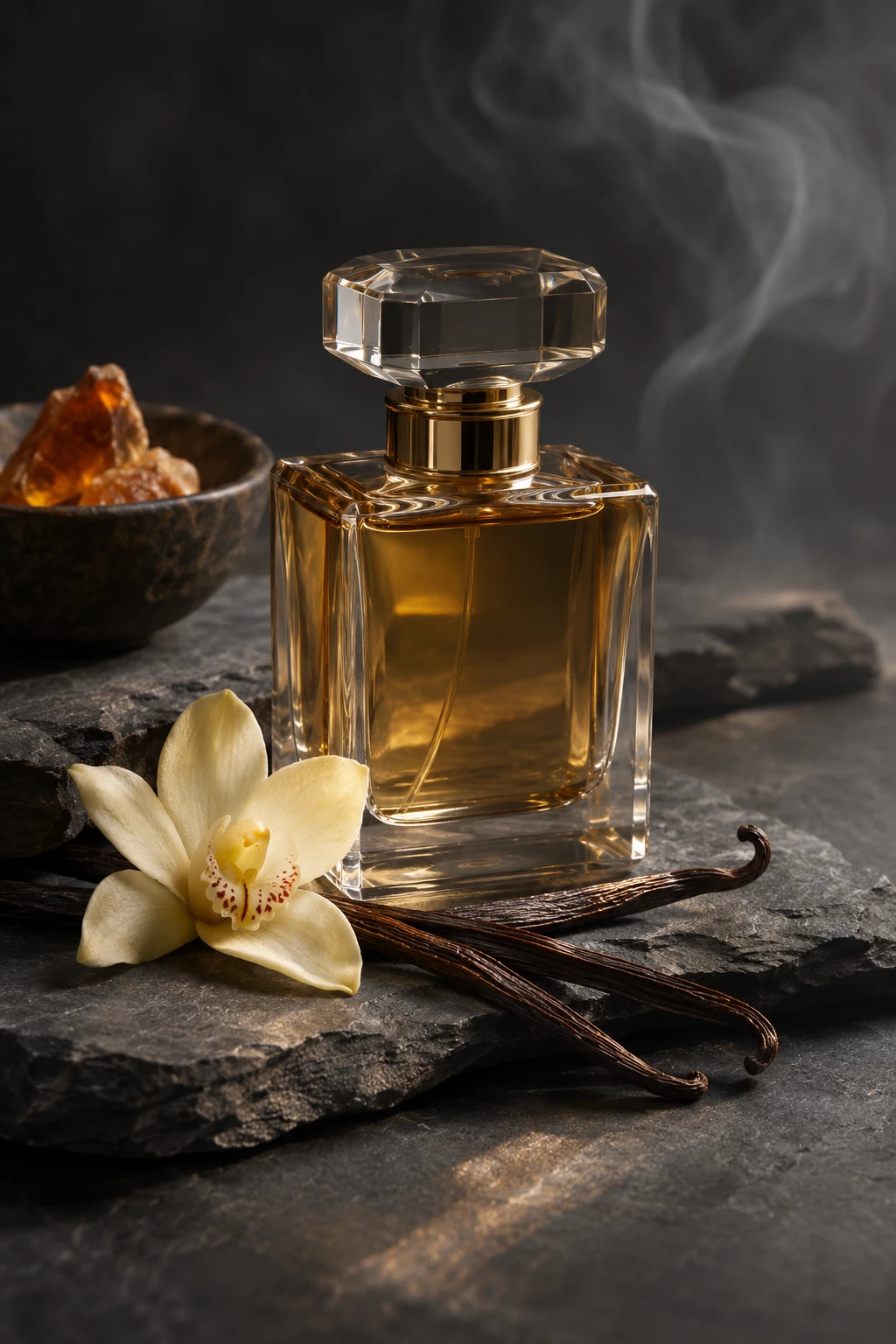
Smoky slate
A thin veil of smoke hangs far behind the bottle. Slate and its irregular edges make the composition feel cool even with warmer liquid in view. Let the darker material occupy more of the frame than the bottle. A clear highlight at the shoulder will carry the eye back from the shadow without flattening it. The glass picks up a faint reflection from the surrounding material.
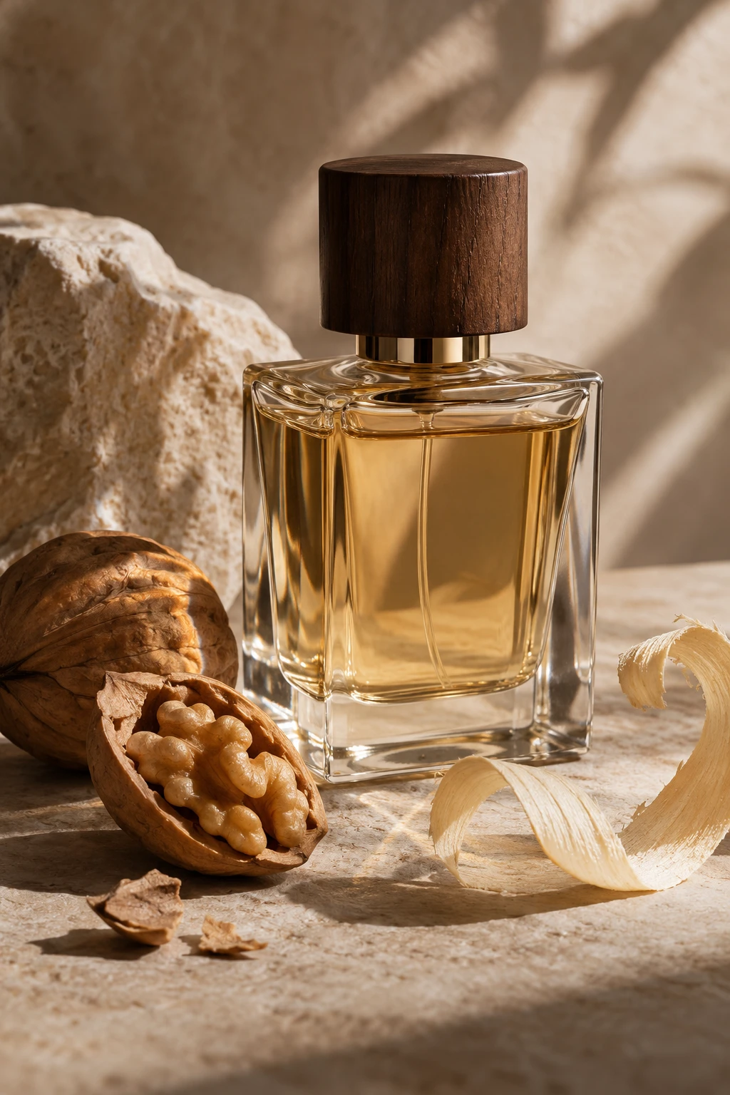
Dry walnut
A split walnut shell gives the bottle a rough edge to play against. The pale surface sets the kernel and polished cap apart. A slightly off-center composition gives the material room to register. Leave some visible space beside the bottle so the eye can take in the texture at its own pace. A narrow strip of shade gives the main object a more distinct outline.
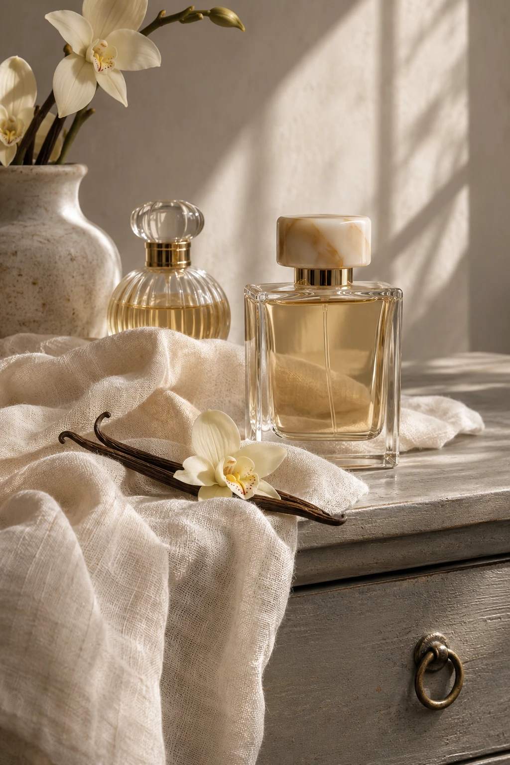
Washed linen
White linen makes a quiet backdrop for pale amber. A grey chest introduces a little age and keeps the setting from feeling like a showroom. Keep the objects at different distances from the light. The nearer detail reads clearly, and the softer edge behind it gives the scene the feel of a real room. The surrounding colors leave room for the clear glass to catch a softer light.
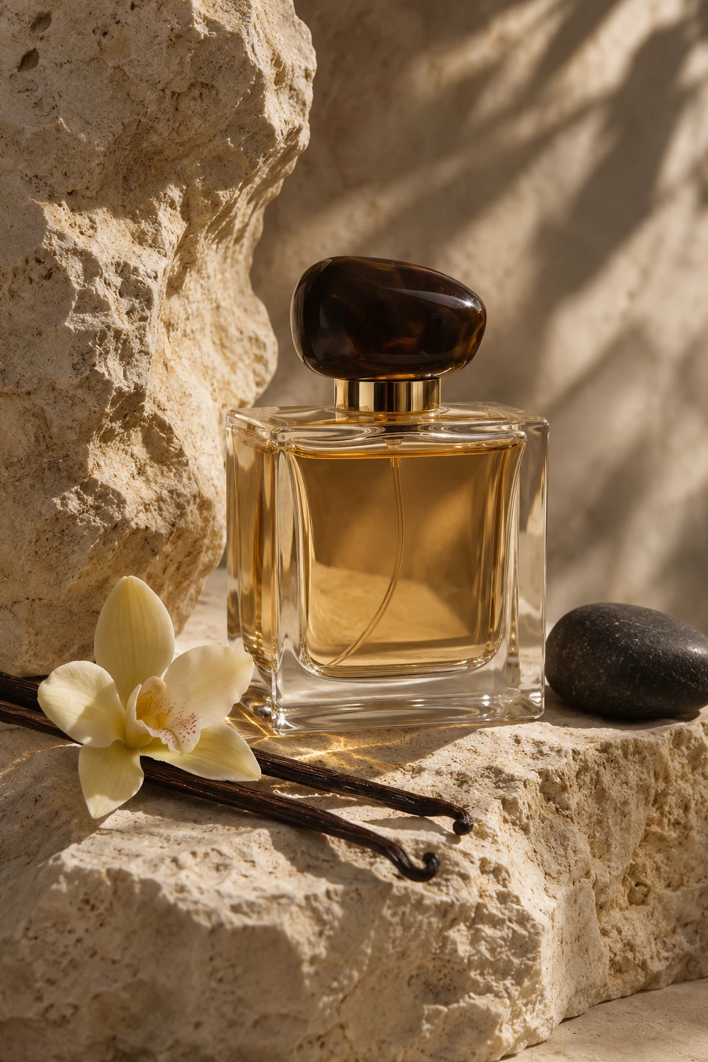
Mineral limestone
Rough limestone draws attention to smooth glass. A single dark pebble gives the eye somewhere to pause before it returns to the bottle. An open patch of surface can hold the composition together. Let the strongest color or texture appear once more in a small detail, leaving room for the bottle to stand out. A slightly quieter background brings the shape of the bottle into view.
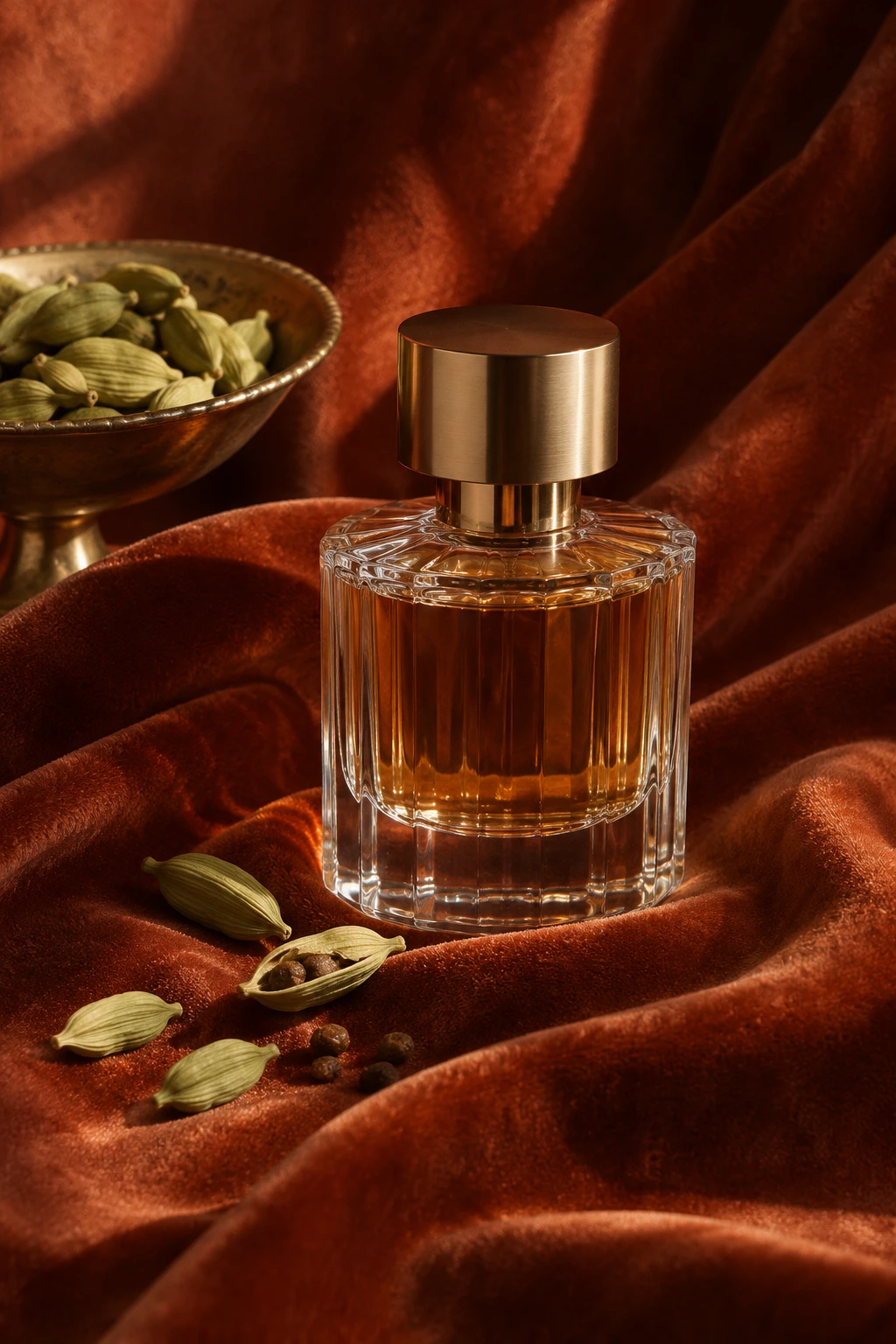
Cardamom velvet
Rust velvet gives this arrangement depth. The small cardamom pods suggest a sharper, greener edge within a palette that otherwise reads warm. Look for the smallest detail that changes the character of the frame. Give it enough space to stay visible and let the rest of the arrangement carry the quieter tones. The uneven light gives the scene a sense of depth at the edges.
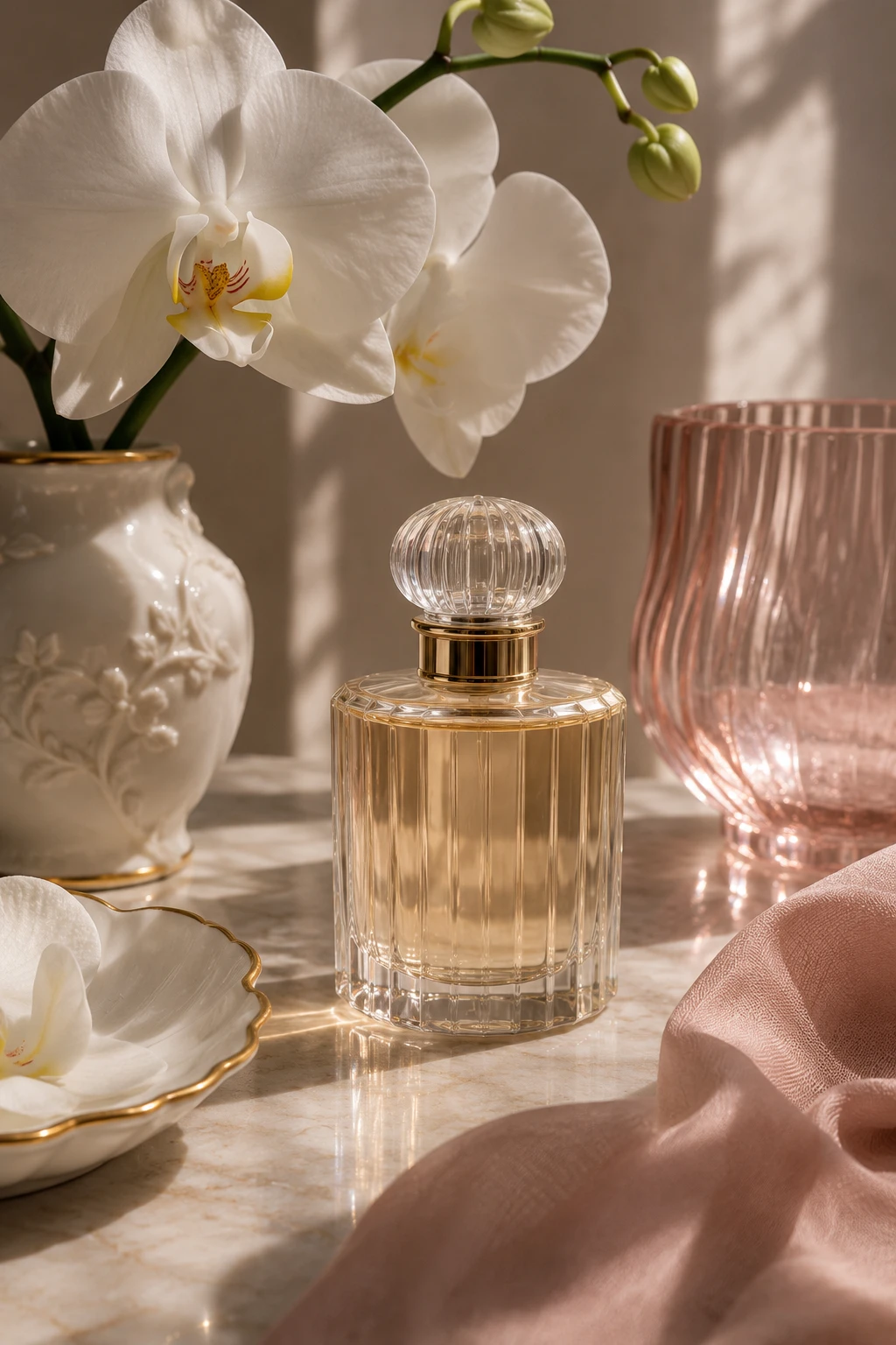
Orchid porcelain
White orchid petals echo the porcelain vase beside clear perfume glass. A separate blush glass accent brings color to the edge of the frame. Let the light come in from one side so the forms keep their depth. A soft shadow along the base is enough to connect the objects to the surface. A softer area of color balances the more precise outline of the glass.
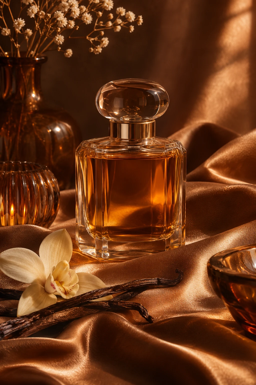
Amber bronze
Bronze silk and amber glass share a color family. Use the difference between a soft reflection and a clear glass edge to keep both visible. The image works best when the eye can move between two points of interest. Use the brightest reflection sparingly so the softer material still has its own presence. The surrounding surface stays visible, giving the bottle a sense of scale.
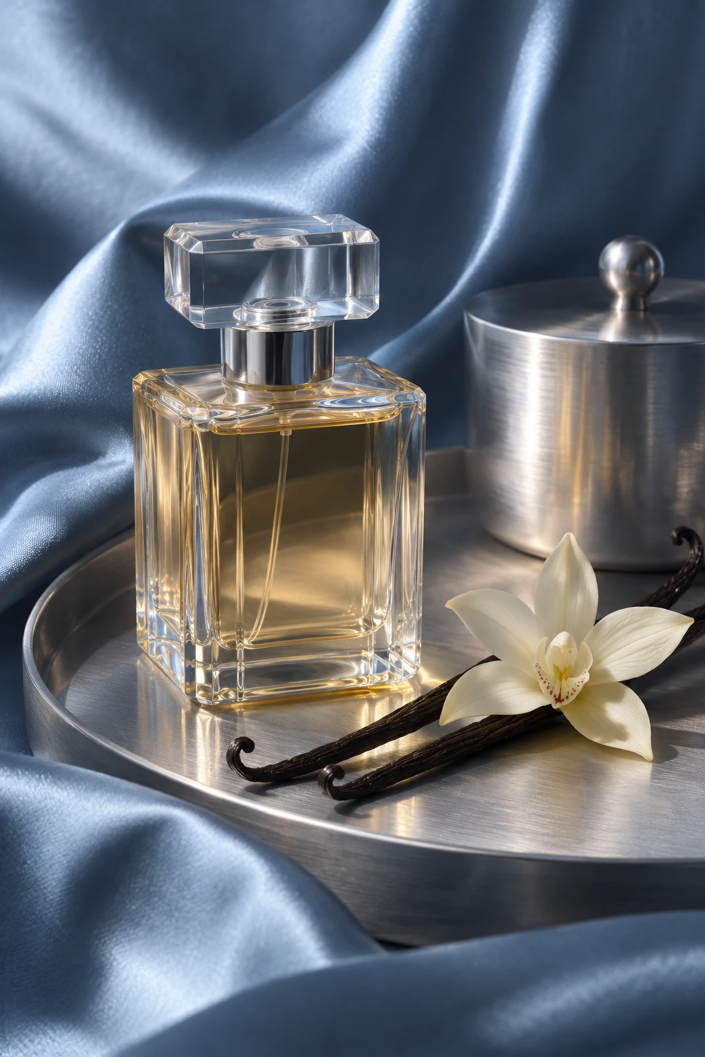
Cool blue silk
Blue silk introduces a cool color opposite the warmer liquid. Brushed silver repeats the light in a more restrained way than a mirror. Keep a little distance between the main objects. That interval makes the differences in scale, color and surface easier to see, especially when the image is viewed small. A few restrained details are enough to make the arrangement feel complete.
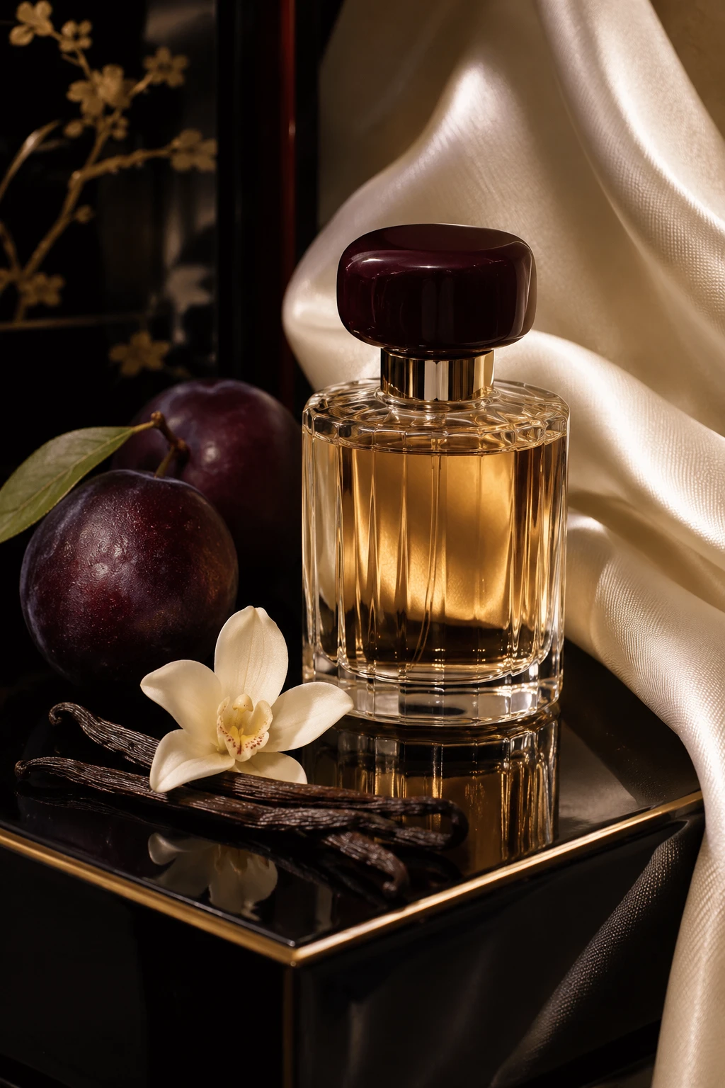
Plum lacquer
Dark lacquer and plum supply the deepest tones in the series. A narrow ivory fold gives the edge of the amber glass enough contrast to stay legible. Use the remaining space to show where the light falls. A quieter area at one edge makes the more detailed part of the photograph feel deliberate. The quietest part of the frame leaves some room to imagine the scent.
Look at the material you remember after the bottle leaves the frame. The contrast between that surface and the glass is often what gives each version its character.
IMAGE CREDIT
Original AI-generated imagery by YEUNORY. These visual concepts depict imagined bottles, interiors and objects; they are not photographs of products for sale.